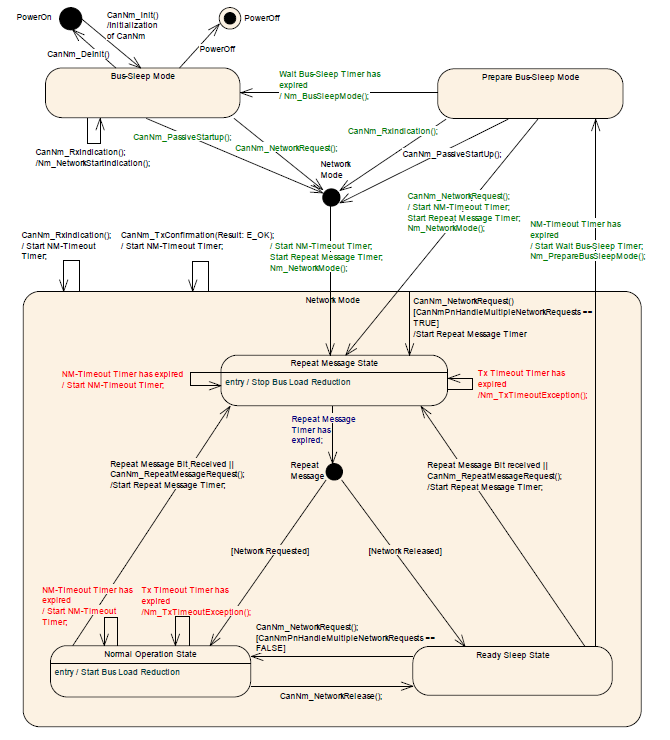
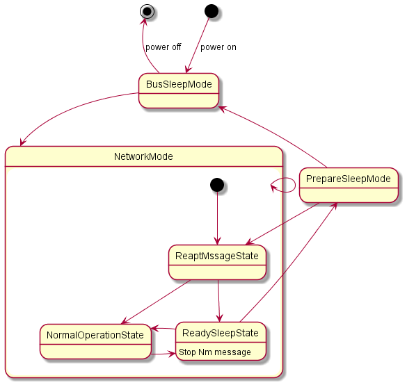
How to optimize the layout of this state diagram? The default state diagram is too ugly

0 votes
asked Aug 4, 2021 in Question / help by Kuhn (120 points)

code:

@startuml

[*]--> BusSleepMode :power on

BusSleepMode -up->[*] : power off

state NetworkMode {

    [*] --> ReaptMssageState

    ReaptMssageState -down-> NormalOperationState

    ReaptMssageState -down-> ReadySleepState

    NormalOperationState -right-> ReadySleepState

    ReadySleepState -left-> NormalOperationState

    ReadySleepState : Stop Nm message 

BusSleepMode -down-> NetworkMode

PrepareSleepMode -left-> BusSleepMode

ReadySleepState -up-> PrepareSleepMode

NetworkMode --> NetworkMode

PrepareSleepMode -down-> ReaptMssageState

@enduml

 default genreted picture

default genrented picture

 expect picture

1 Answer

0 votes
answered Aug 7, 2021 by Martin (8,360 points)
edited Aug 7, 2021 by Martin

If you add an extra rank depth between "PrepareSleepMode" and "ReaptMssageState" then you get slightly closer to your expected diagram.

PrepareSleepMode --down-> ReaptMssageState

[click diagram for online server]

Using the <<end>> stereotype, you can have the middle dots of your expected diagram.  For some reason there is no <<start>> stereotype to get the fully black dot.

[click diagram for online server]

...