Without STYLE, some Deployment diagram shapes have black borders and some have red borders (I'm curious as to why - are they following a documented standard?). Doc example.
But with STYLE, they are all red. This means a shape's look can change if you add a STYLE block, even if it should not affect it. Which is unexpected.
Also some borders are thinner with STYLE (eg rectangle & component) and some borders are thicker (eg actor & entity).
@startuml
label A [
{{
rectangle A
}}
]
label B [
{{
<STYLE>
</STYLE>
rectangle B
}}
]
@enduml
The intention may be to move to a more uniform/crisper look without affecting legacy diagrams; but it would be nice to have that stated as deliberate, so that future questions about this can be pointed at the reason.
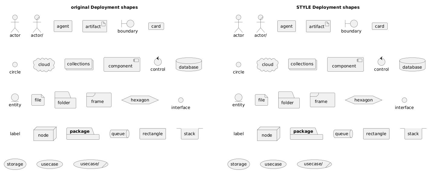 (And the title style changes too)